Activity 22 - Frequency distribution
Create a new file called plotFrequency.py and save to your cs100/ch4 folder.
Copy and paste the following code into the file.
import turtle
import math

#
def mean(alist):
   mean = sum(alist) / len(alist)
   return mean


#
def frequencyChart(alist):

    #
    countdict = {}

    #
    for item in alist:
       if item in countdict:
           countdict[item] = countdict[item]+1
       else:
           countdict[item] = 1

    #
    itemlist = list(countdict.keys())
    minitem = 0
    maxitem = len(itemlist)-1

    #
    countlist = countdict.values()
    maxcount = max(countlist)

    #
    #
    wn = turtle.Screen()
    chartT = turtle.Turtle()
    wn.setworldcoordinates(-1,-1,maxitem+1,maxcount+1)
    chartT.hideturtle()

    #
    chartT.up()
    chartT.goto(0,0)
    chartT.down()
    chartT.goto(maxitem,0)
    chartT.up()

    #
    chartT.goto(-1,0)
    chartT.write("0",font=("Helvetica",16,"bold"))
    chartT.goto(-1,maxcount)
    chartT.write(str(maxcount),font=("Helvetica",16,"bold"))

    #
    for index in range(len(itemlist)):
        print("Index: ", index)
        chartT.goto(index,-1)
        chartT.write(str(itemlist[index]),font=("Helvetica",16,"bold"))

        chartT.goto(index,0)
        chartT.down()
        chartT.goto(index,countdict[itemlist[index]])
        chartT.up()

    # add code to plot mean of occurrences in red

    wn.exitonclick()


# leave one list assignment uncommented out; try both
lst = [3,3,5,7,1,2,5,2,3,4,6,3,4,6,3,4,5,6,6]
#lst = ['a', 'b', 'c', 'd', 'f', 'c', 'b', 'c', 'a', 'd', 'a', 'b', 'b', 'c', 'b', 'a', 'c', 'd']

#
frequencyChart(lst)
- Run the program with the following lists (uncomment out / comment out the assignment statements to
lstin your file).lst = [3,3,5,7,1,2,5,2,3,4,6,3,4,6,3,4,5,6,6] lst = ['a', 'b', 'c', 'd', 'f', 'c', 'b', 'c', 'a', 'd', 'a', 'b', 'b', 'c', 'b', 'a', 'c', 'd'] -
Read and understand the code. Write short comments above each section of the program (on the lines marked by
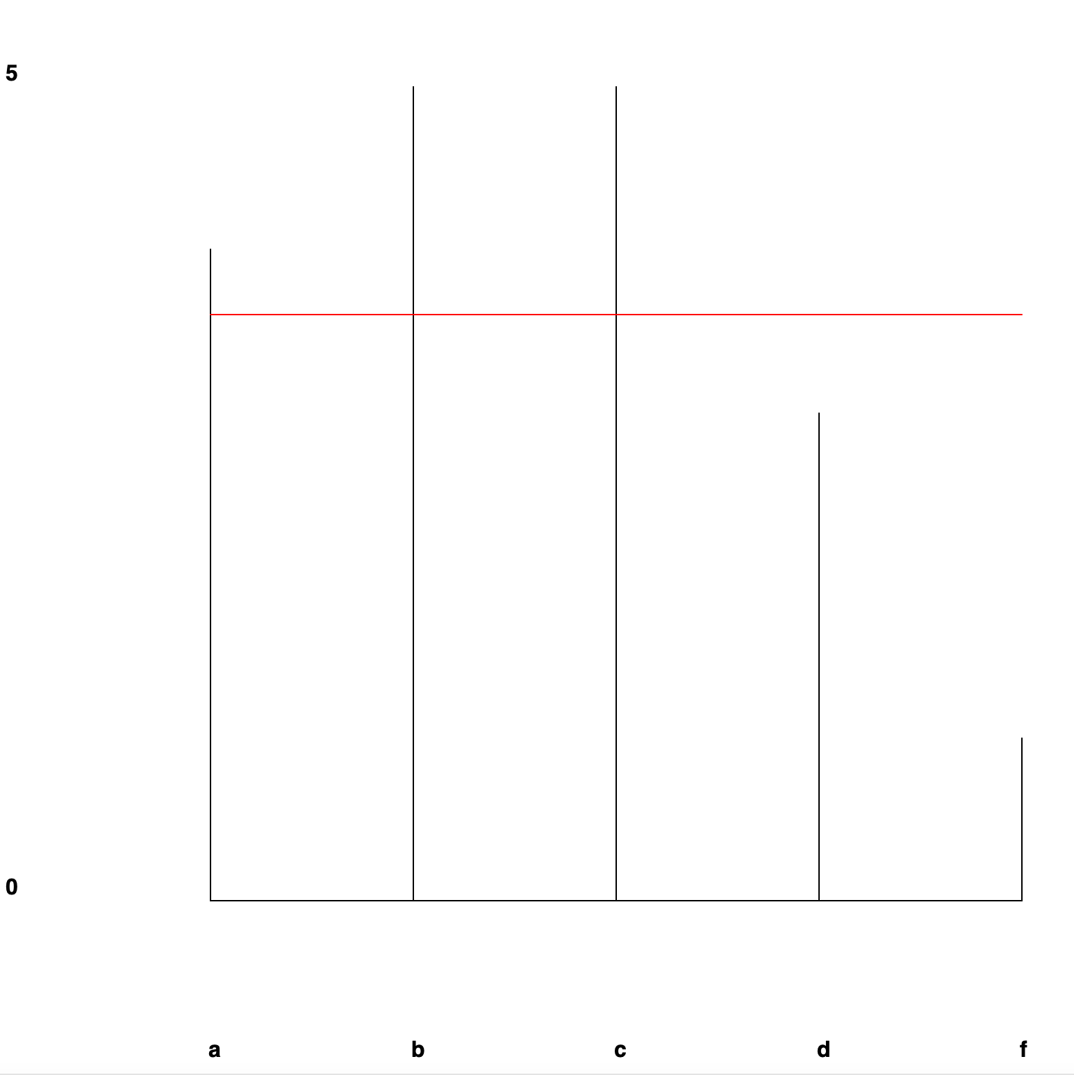
#). - Modify the frequency chart function to draw the mean number of occurrences as a horizontal red line. Note: since the y-axis represents number of occurrences for each item along the x-axis, this red line is the mean number of occurrences.
For example:
If you finish early
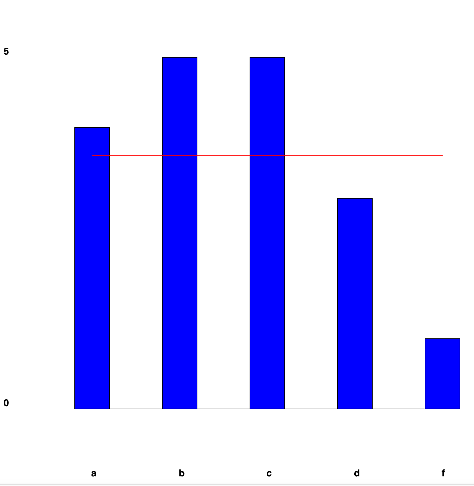
Modify the frequency chart function to:
- draw wide bars instead of lines.
- have randomly colored bars.
For example:
How to submit
Submit your working python file to Moodle.